An Alternative UI for Steam's Big Picture Mode
On the Steam Community Forums, I have just come across the work done by one Steam Community member on the Steam Big Picture mode UI. He proposed a whole redesign of the interface to make it look more modern and beautiful. And while I do like the current looks of the Big Picture mode, I have to admit his version is impressive and even a step further. Let’s have a quick look at what Cales Lares from Santiago (Chile), proposed.
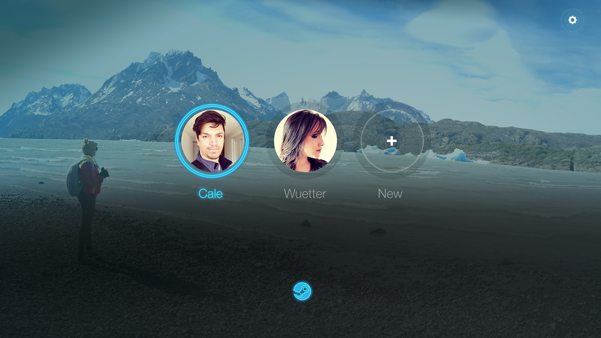
This is the login screen. Simple. Very clean.
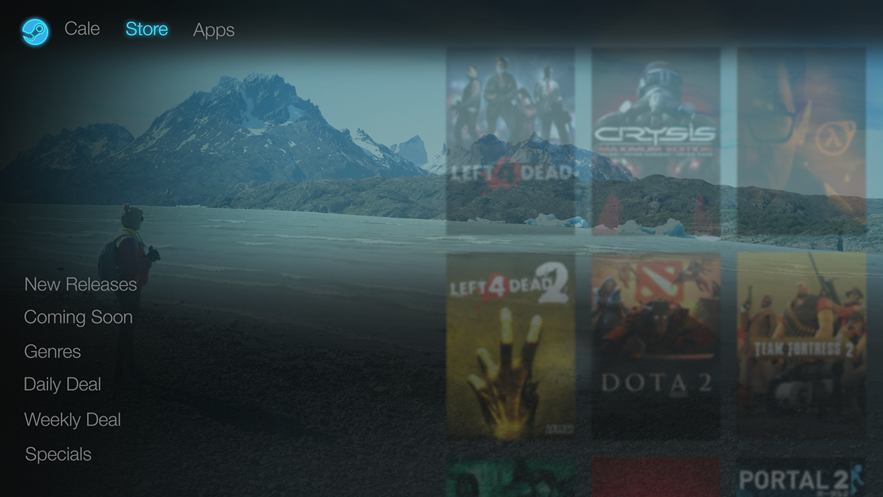
And here you go, the main menu… with a nice transparency effect between your wallpaper and your game library.
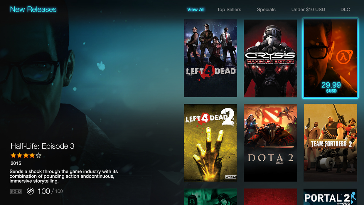
In the New Releases section, a large place is allocated for the games covers, and a game-related wallpaper is shown in the background, very much like in some XBMC themes. HL Episode 3, anyone ?
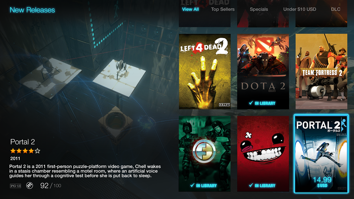
Here’s another example with Portal 2. I like the vertical covers, they look very classy, much more than the current 4:3 aspect ratio ones we have on Steam currently.
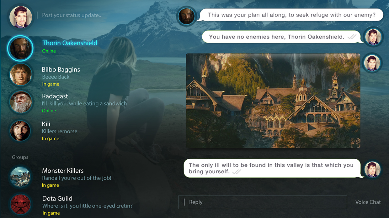
And this is what a group discussion may look like. I don’t find that one THAT good looking, but I guess it fits with the rest of his work on the UI.
And now, everything in a single video.
Very nice, indeed. Maybe Valve could steal some his ideas or design elements to build up on their current interface. And I feel they could fix the current Non-Big Picture Mode as well, which is cluttered with way too much information to my taste.

